Designing a Spanish Bodega with a Brazilian Soul
Bodega Pepito was born from a cultural collision:
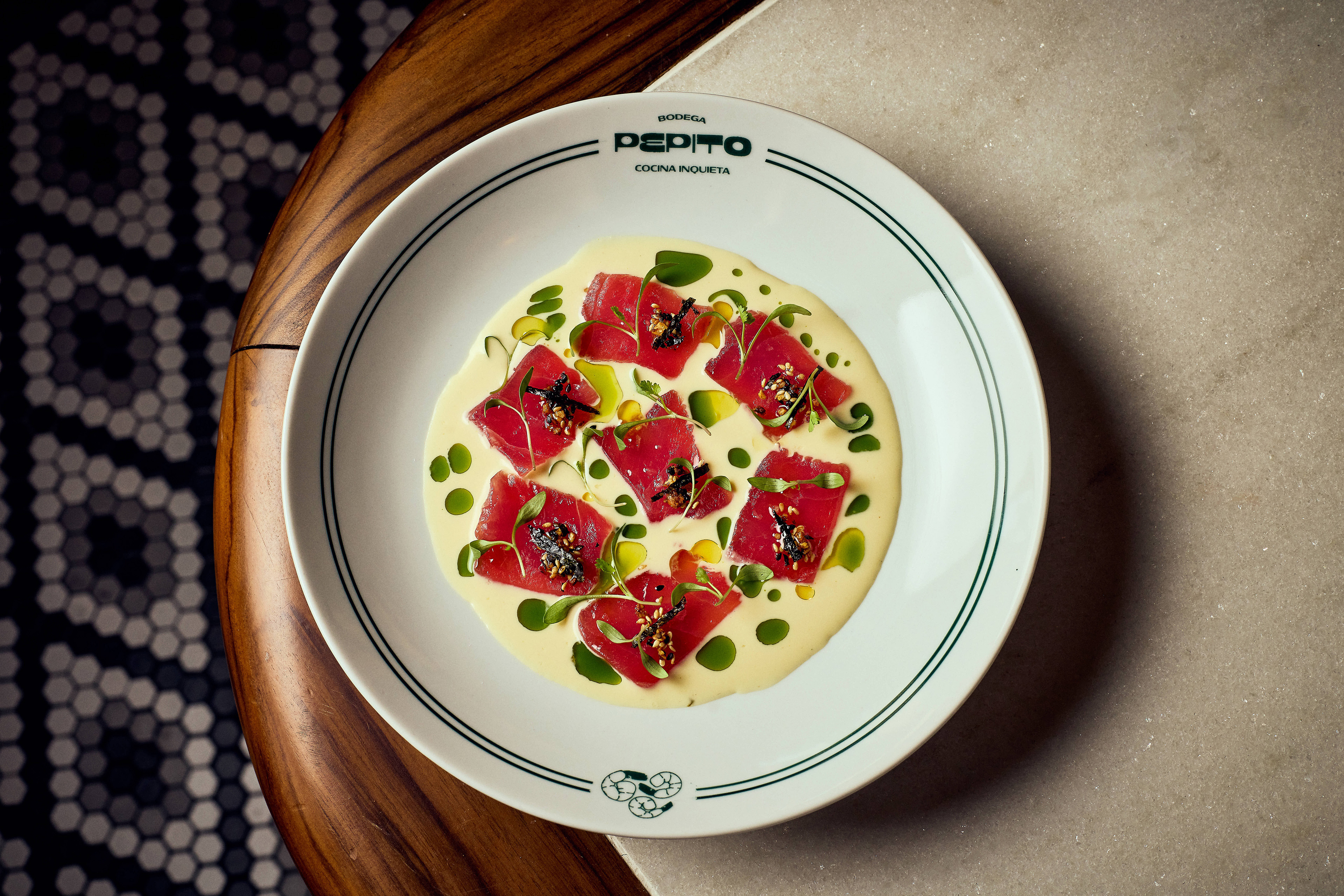
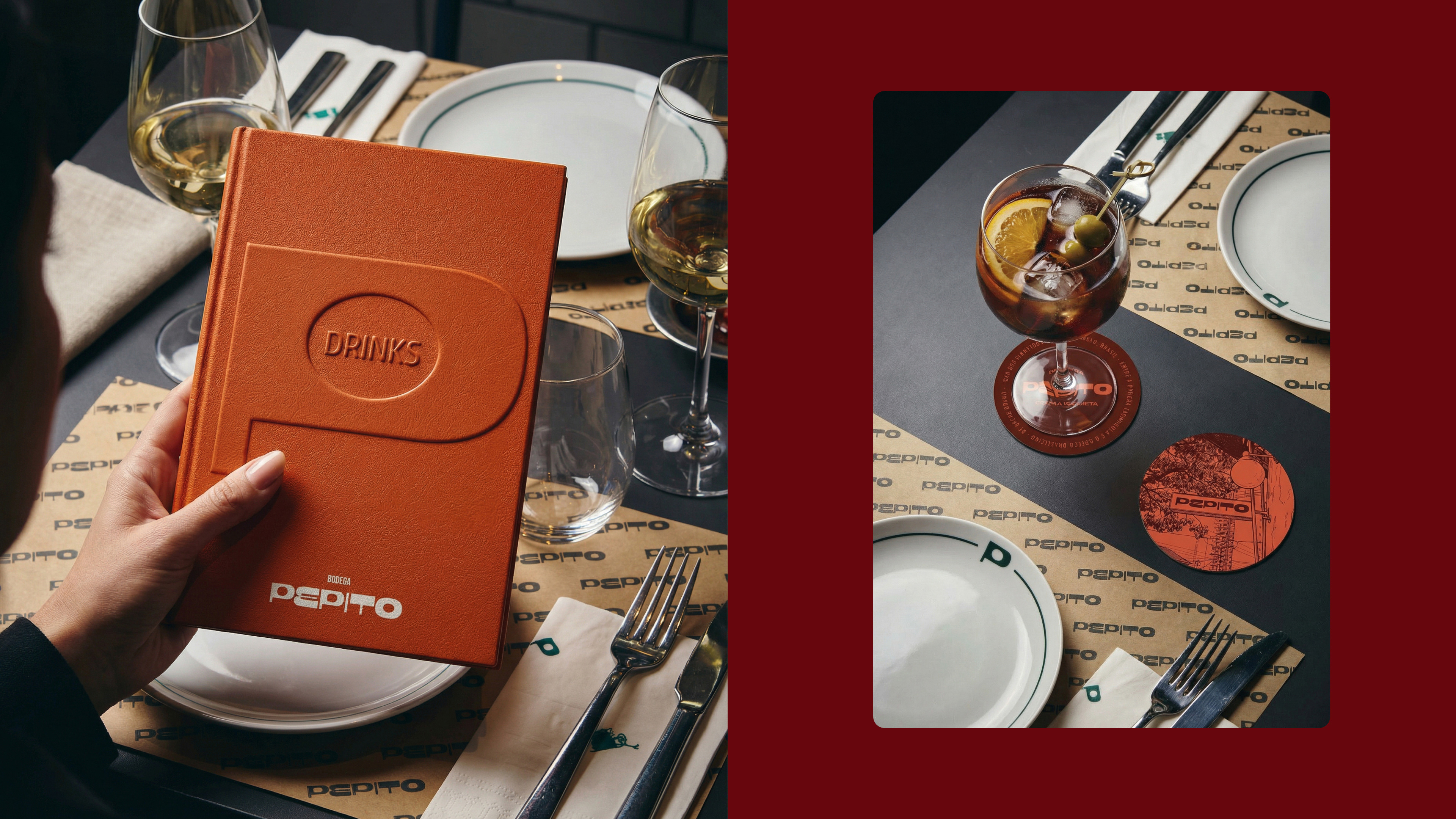
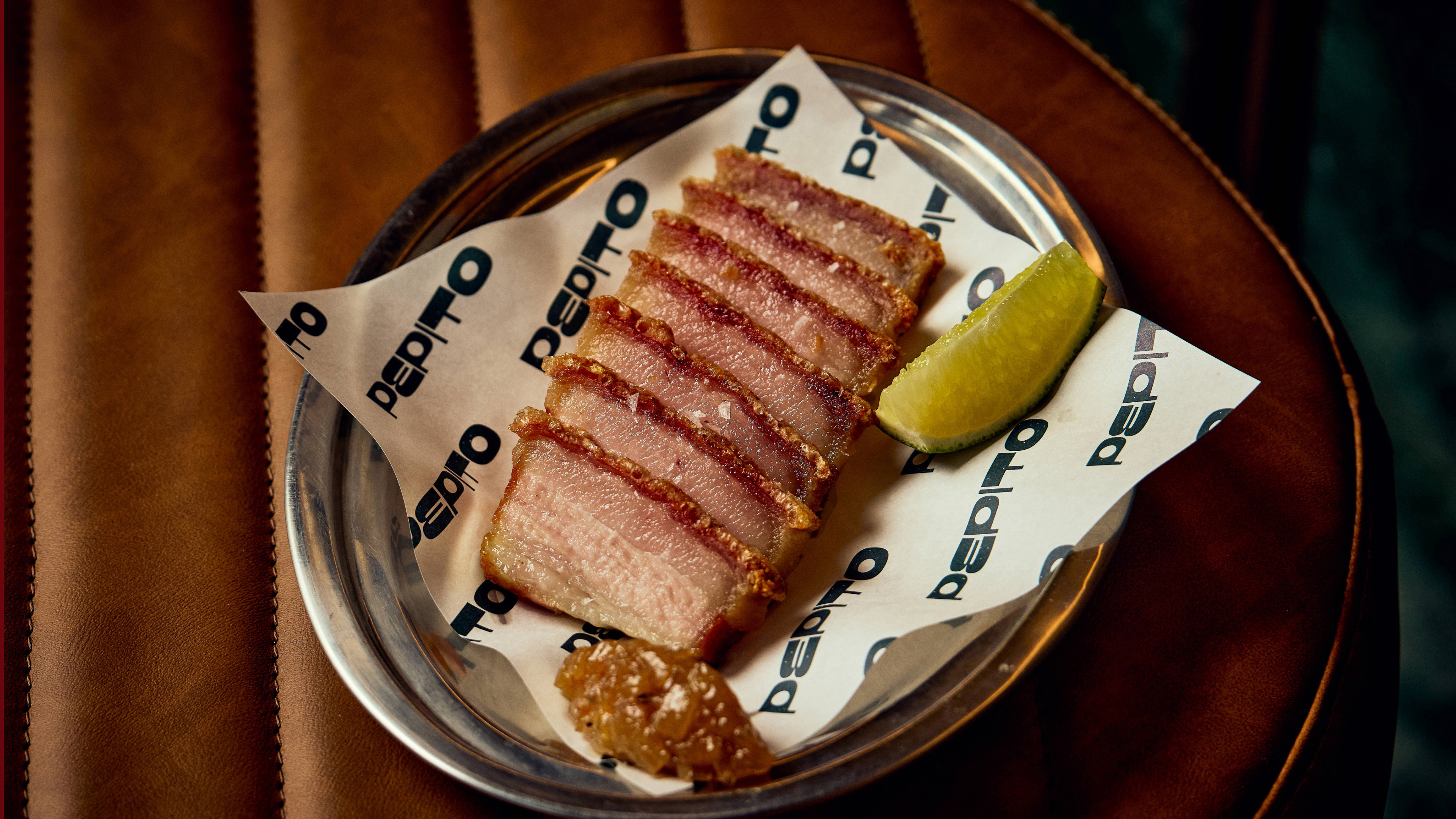
The spirit of a traditional Spanish bodega meets the informality of a Brazilian boteco in the heart of São Paulo. Located on Rua dos Pinheiros, the project introduces the Iberian cuisine of Catalan chef Oscar Bosch through a language that feels accessible, playful, and deeply social.
The spirit of a traditional Spanish bodega meets the informality of a Brazilian boteco in the heart of São Paulo. Located on Rua dos Pinheiros, the project introduces the Iberian cuisine of Catalan chef Oscar Bosch through a language that feels accessible, playful, and deeply social.
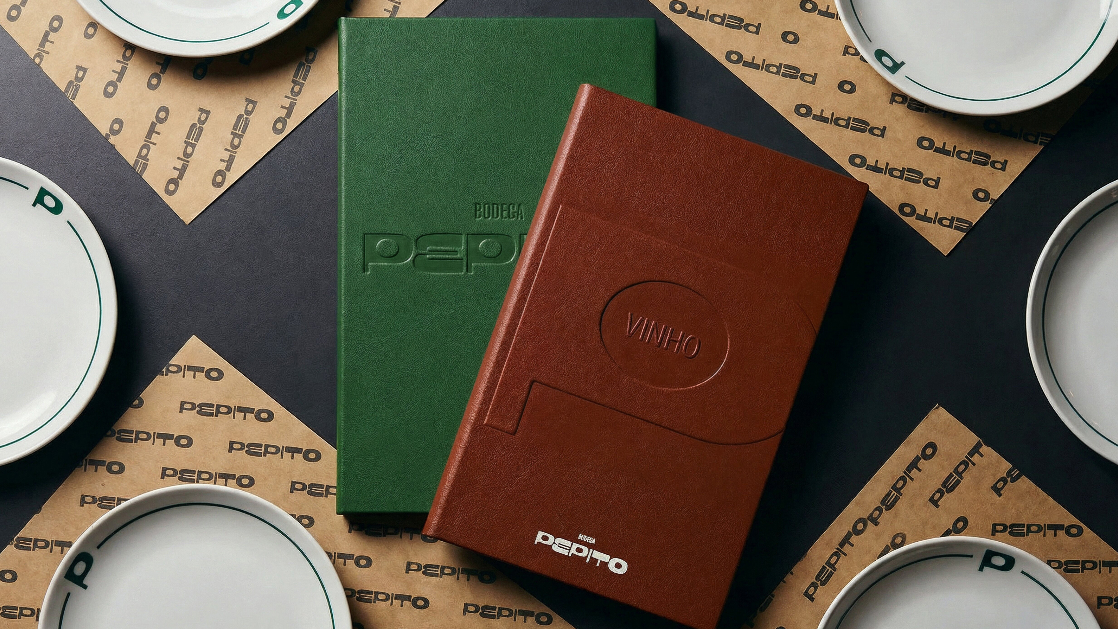
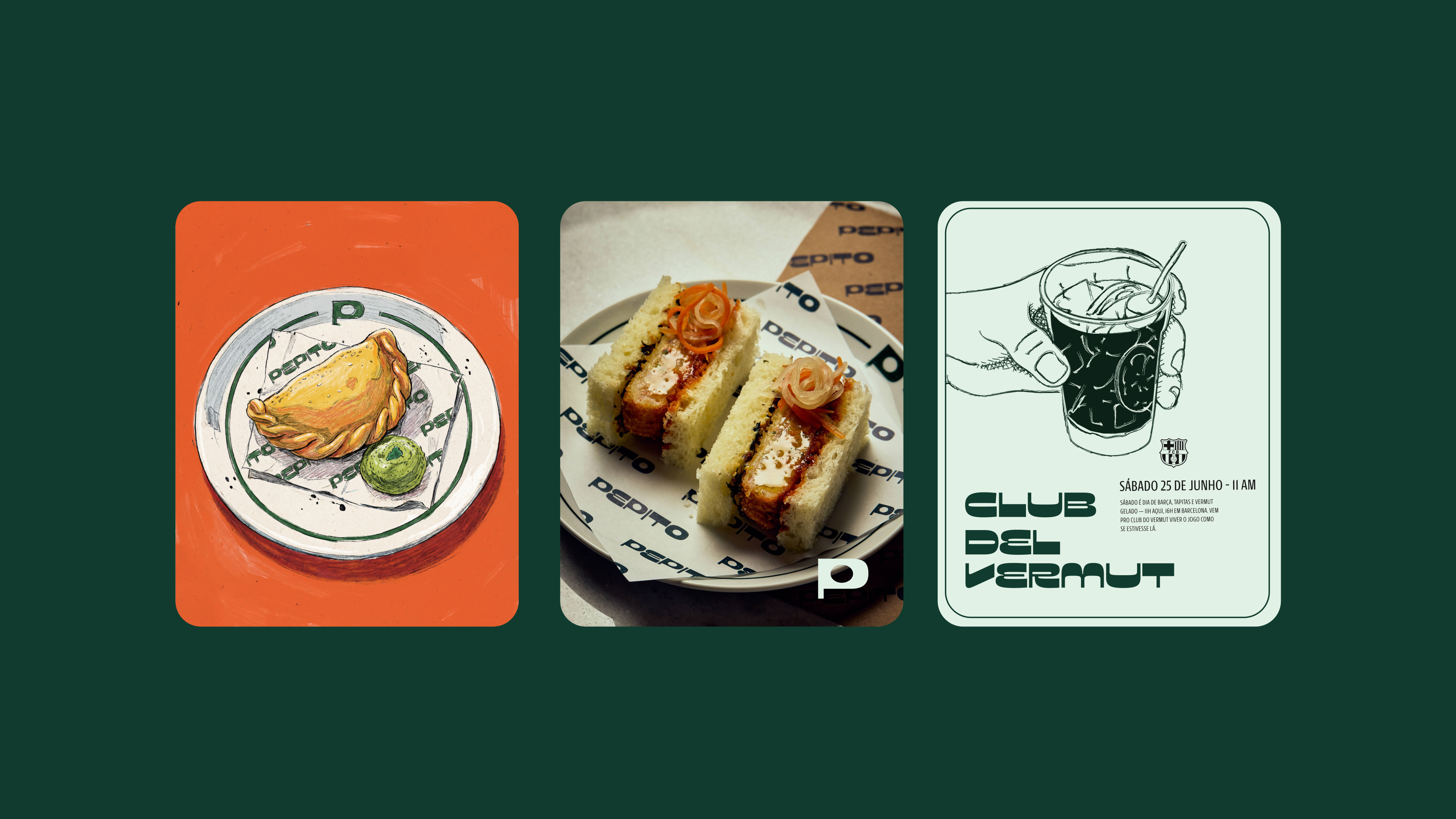
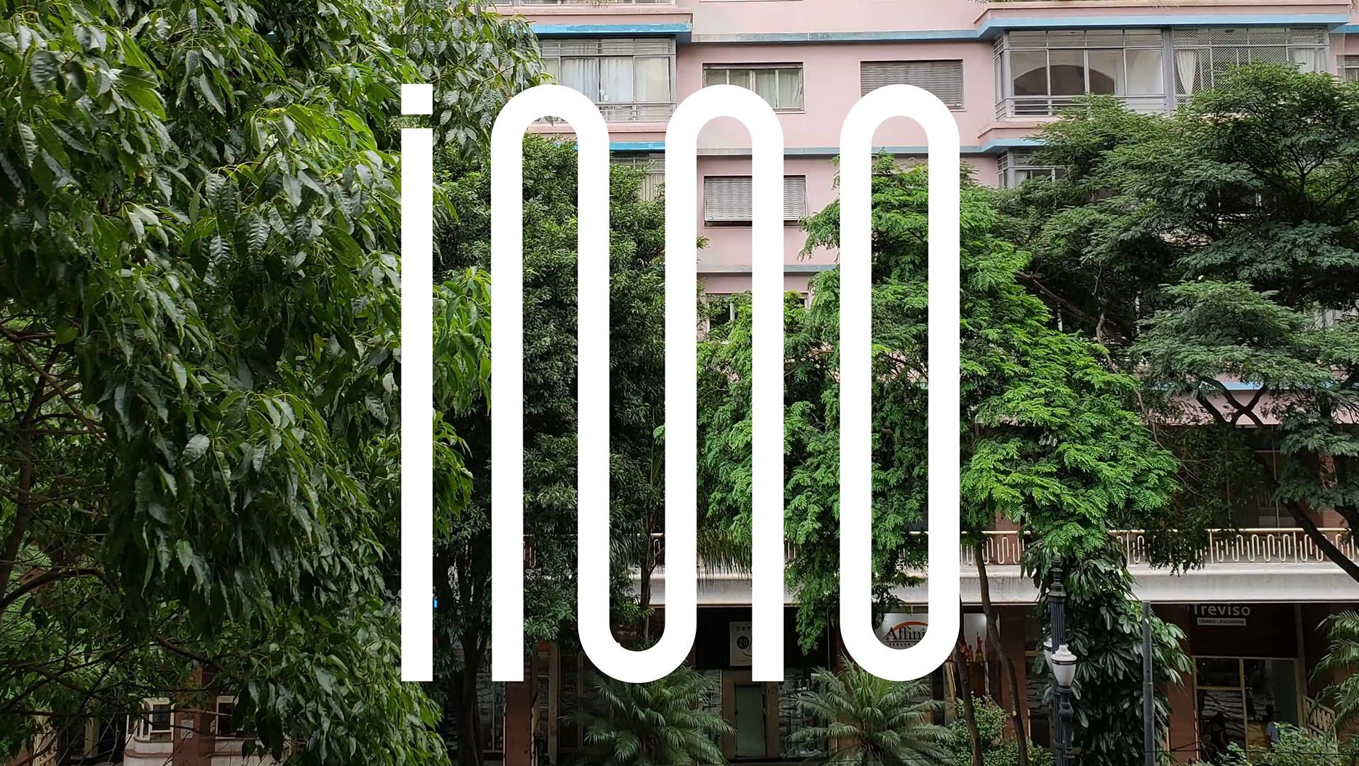
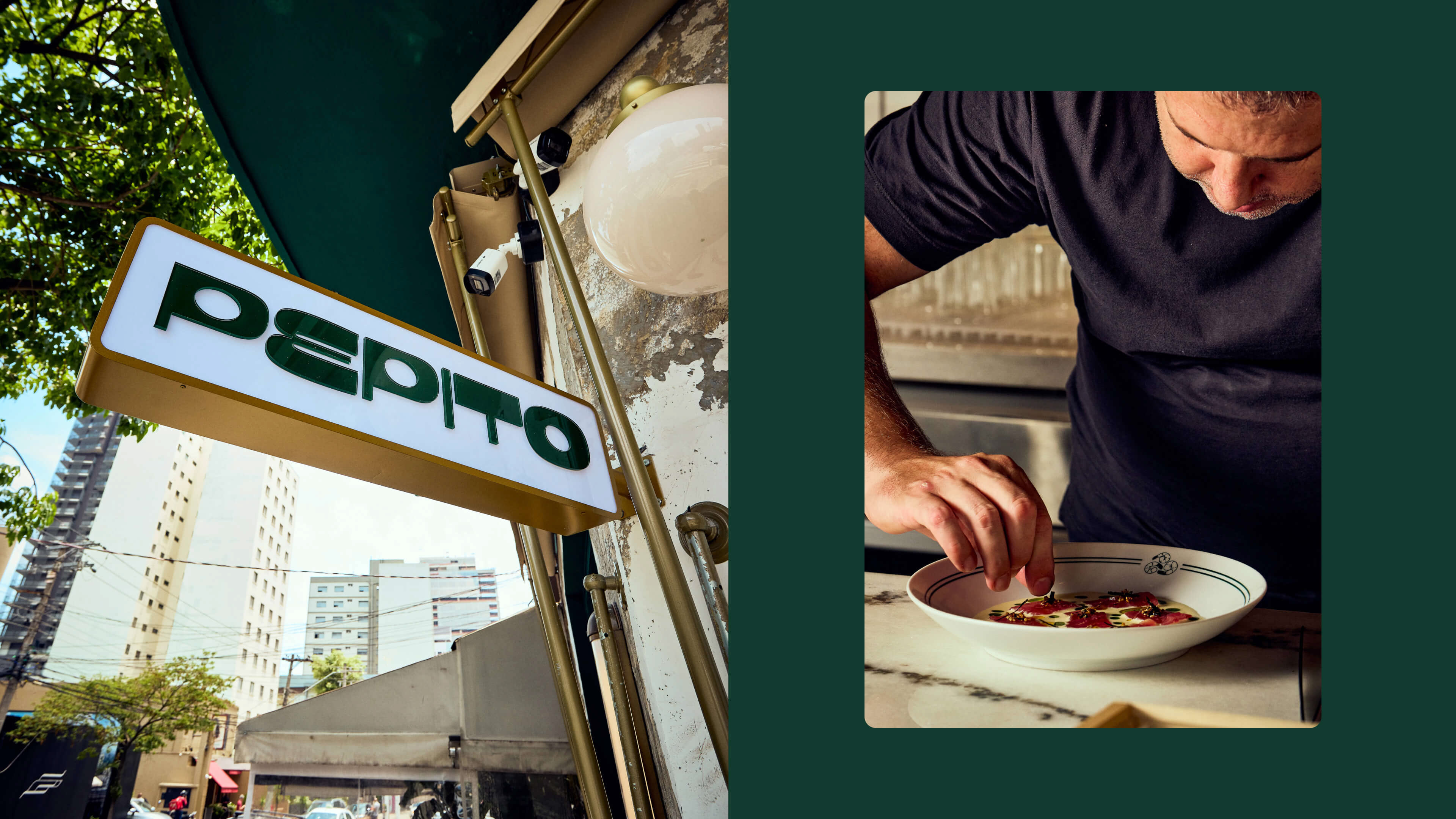
The identity translates this duality into a visual system that is both Mediterranean and, simultaneously, local. The logo transforms the counterform of the typography into an olive—a subtle symbol of Spanish tavern culture. The olive, traditionally paired with vermouth, becomes a recurring graphic gesture, anchoring the brand in ritual and memory.
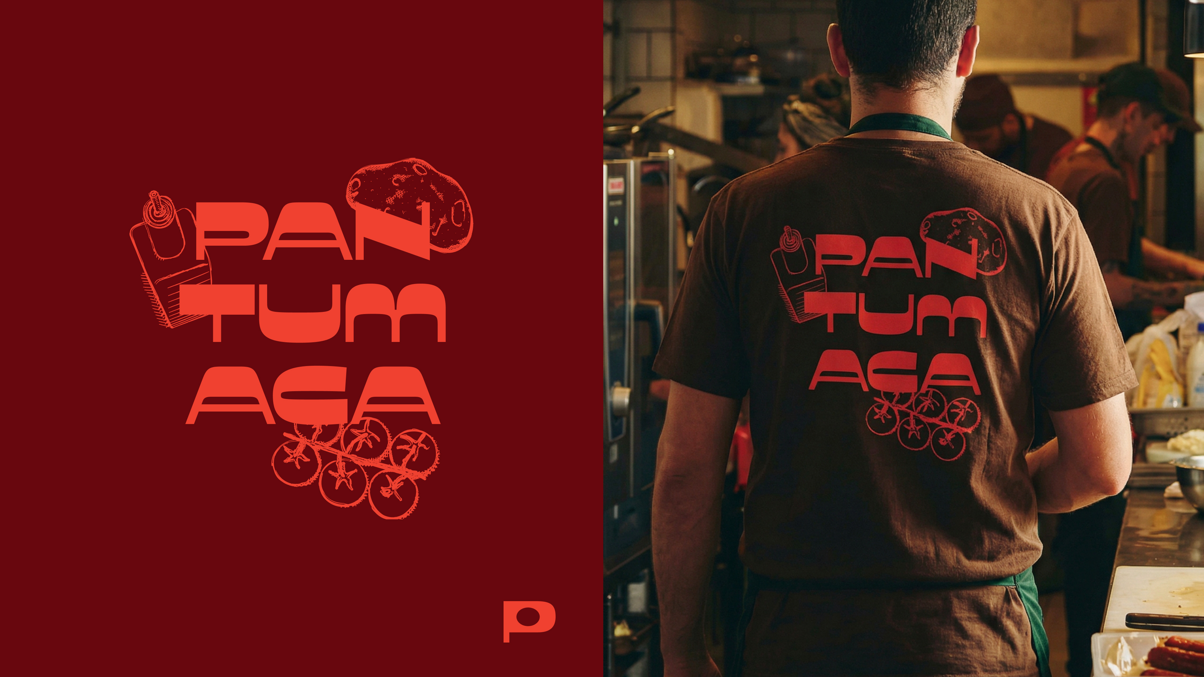
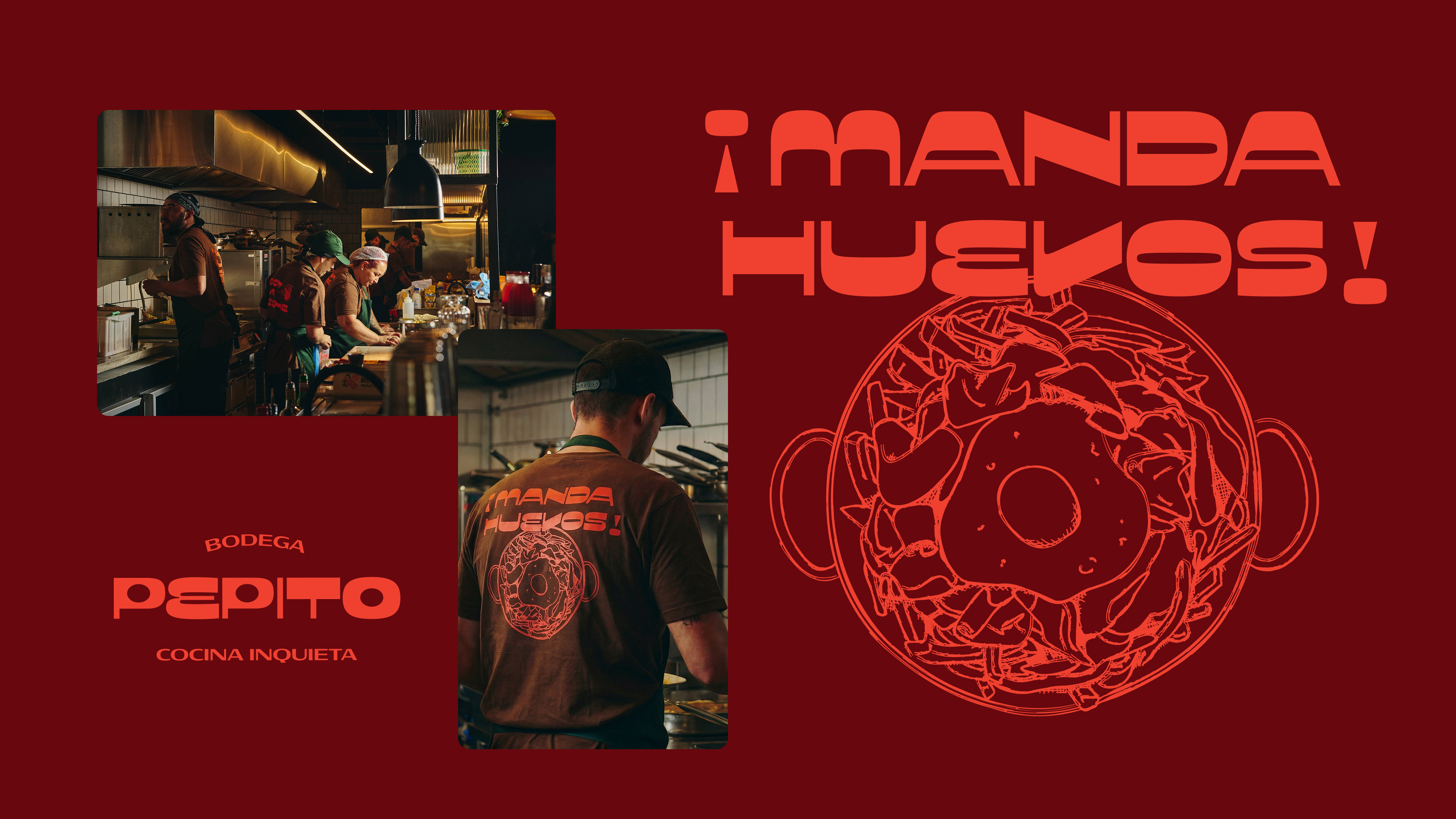
The type design was shaped in dialogue with the architecture itself. Straight angles and soft curves echo the facade, creating a visual rhythm that ties signage, interiors, and printed materials into one cohesive voice. The result is a brand that feels spontaneous yet intentional: a bodega designed to celebrate everyday gatherings, generous plates, and long conversations around the table.
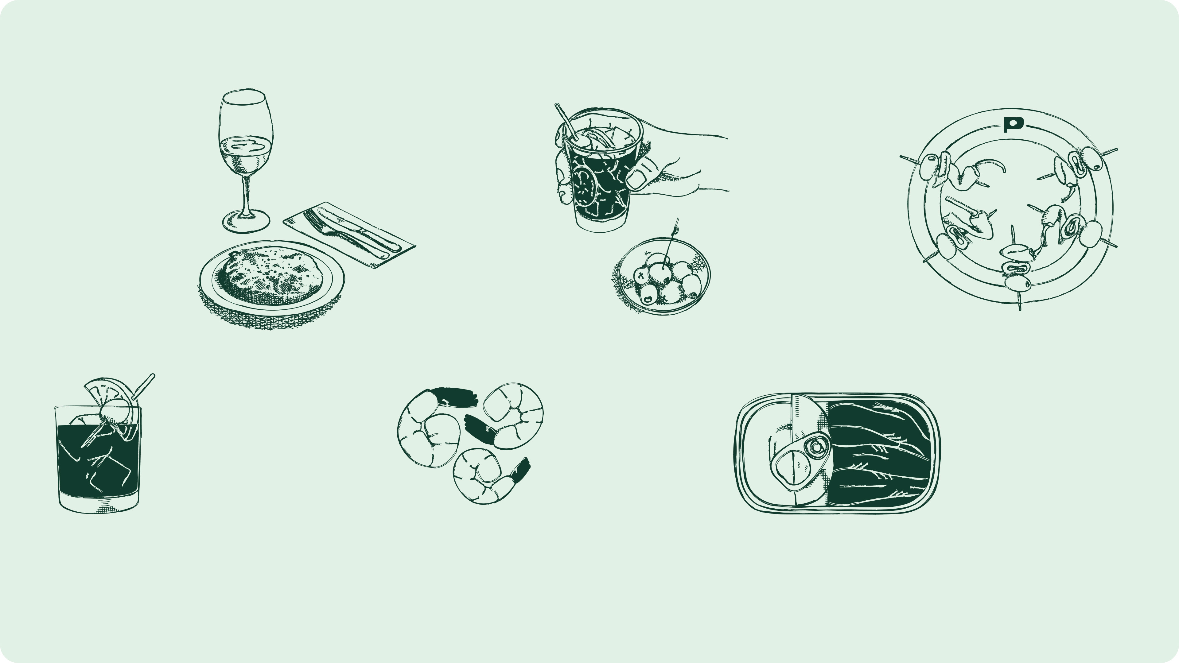
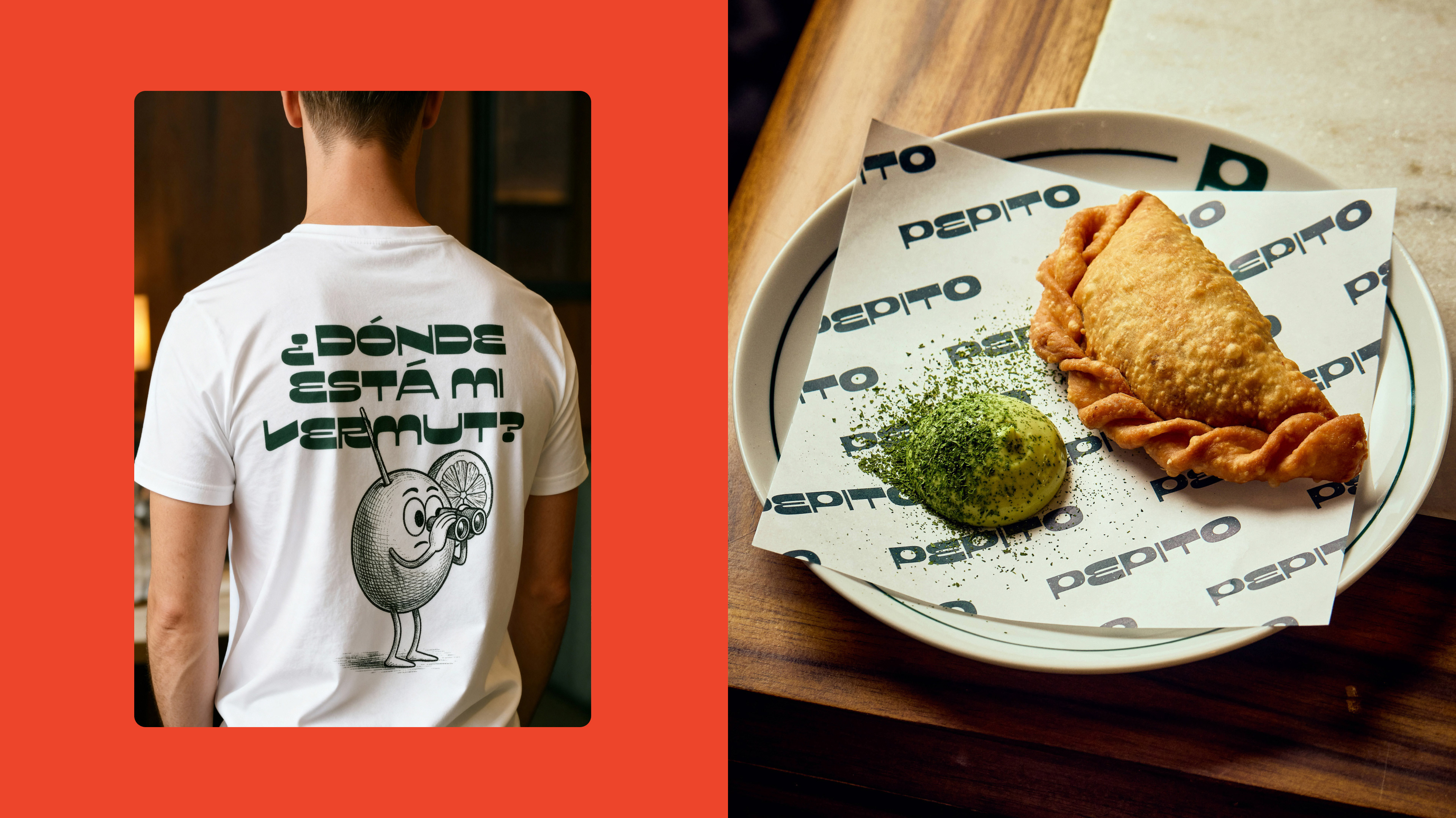
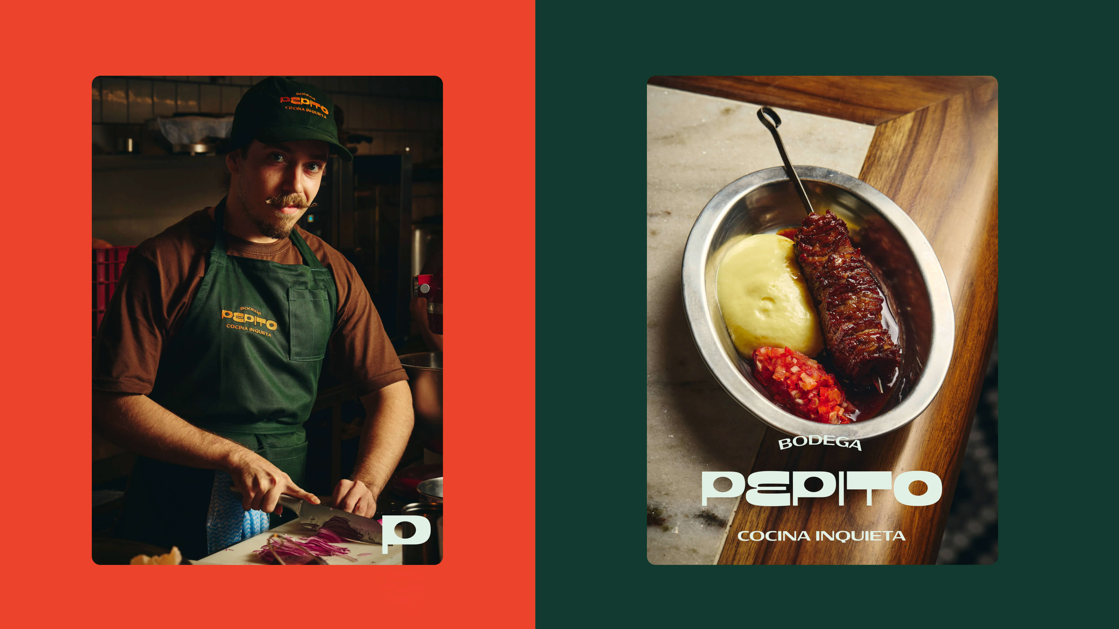
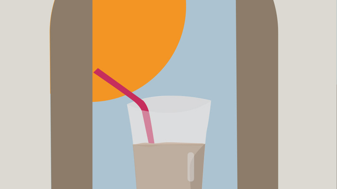
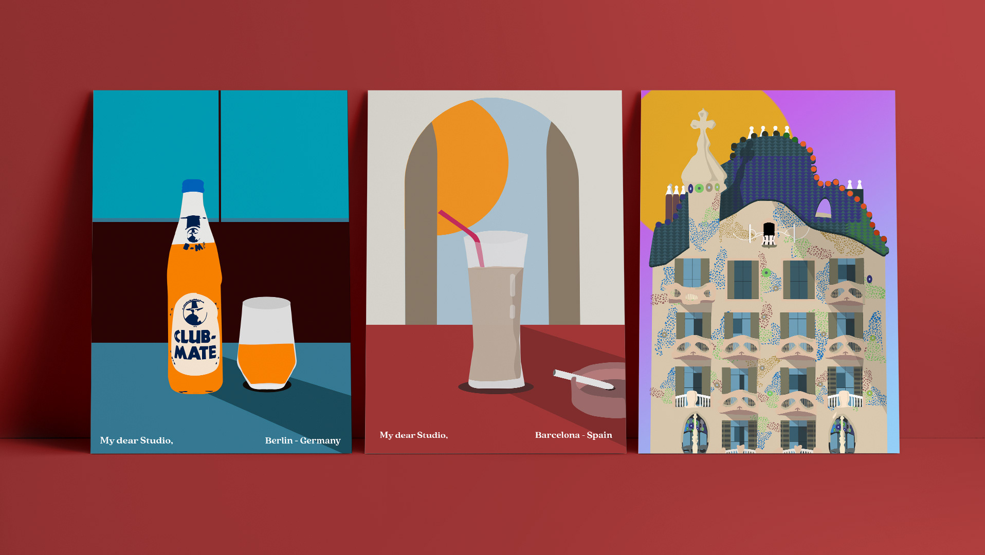
Illustration plays a central role in extending this personality. A set of simple, hand-drawn illustrations was created to adorn plates, napkins, and tactile surfaces—a graphic addition that feels intimate and human. In digital spaces, the identity intentionally opens up to multiple interpretations: illustrations by different artists coexist within the brand universe. This visual plurality reflects the cultural richness of Spanish bodega traditions and reinforces the idea of a living, collaborative space that is constantly evolving.
by My dear Studio
Illustrations: Lorenah Oliveira
Illustrations: Lorenah Oliveira