Designing a Pizza Place for the Pubblico
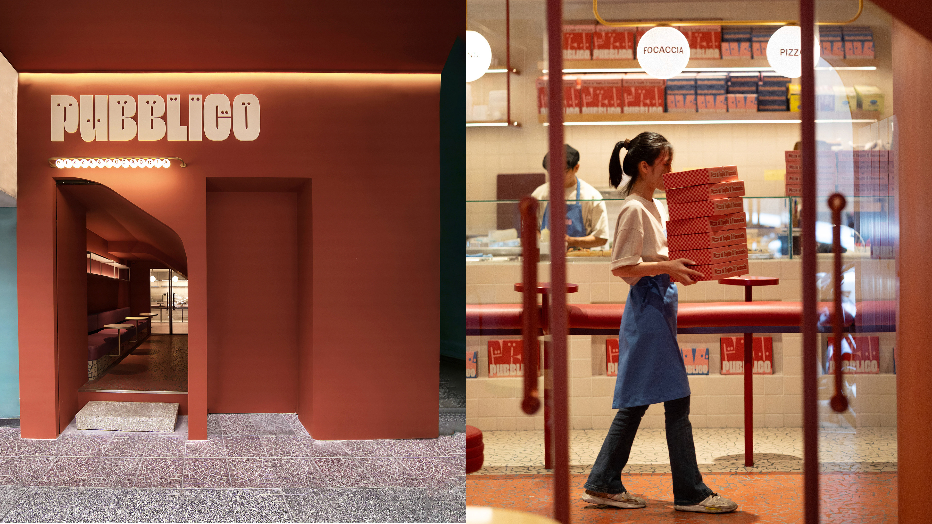
Pubblico brought us a delicious challenge: to shape the identity of a casual Italian spot in the heart of Ho Chi Minh City. Their vision was clear—celebrate the joy of sharing food with friends, while standing out with a playful, modern personality.
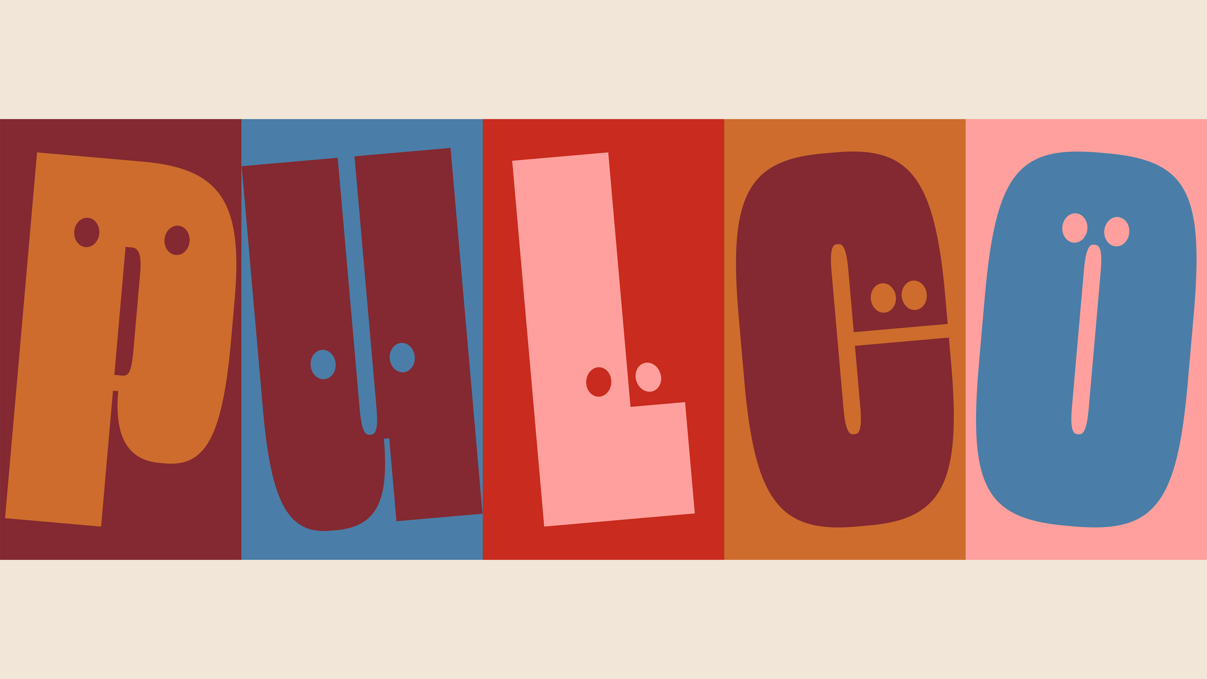
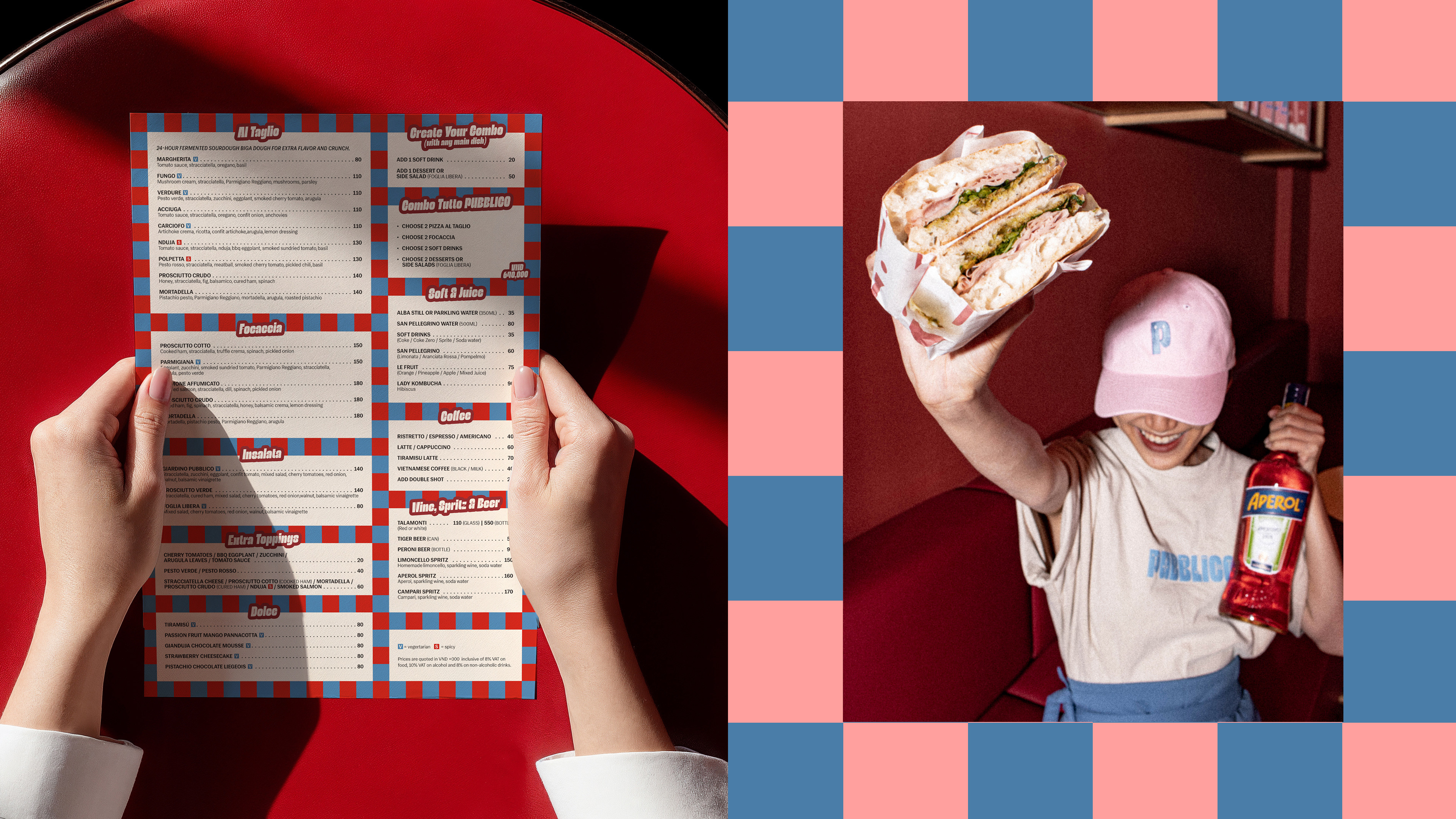
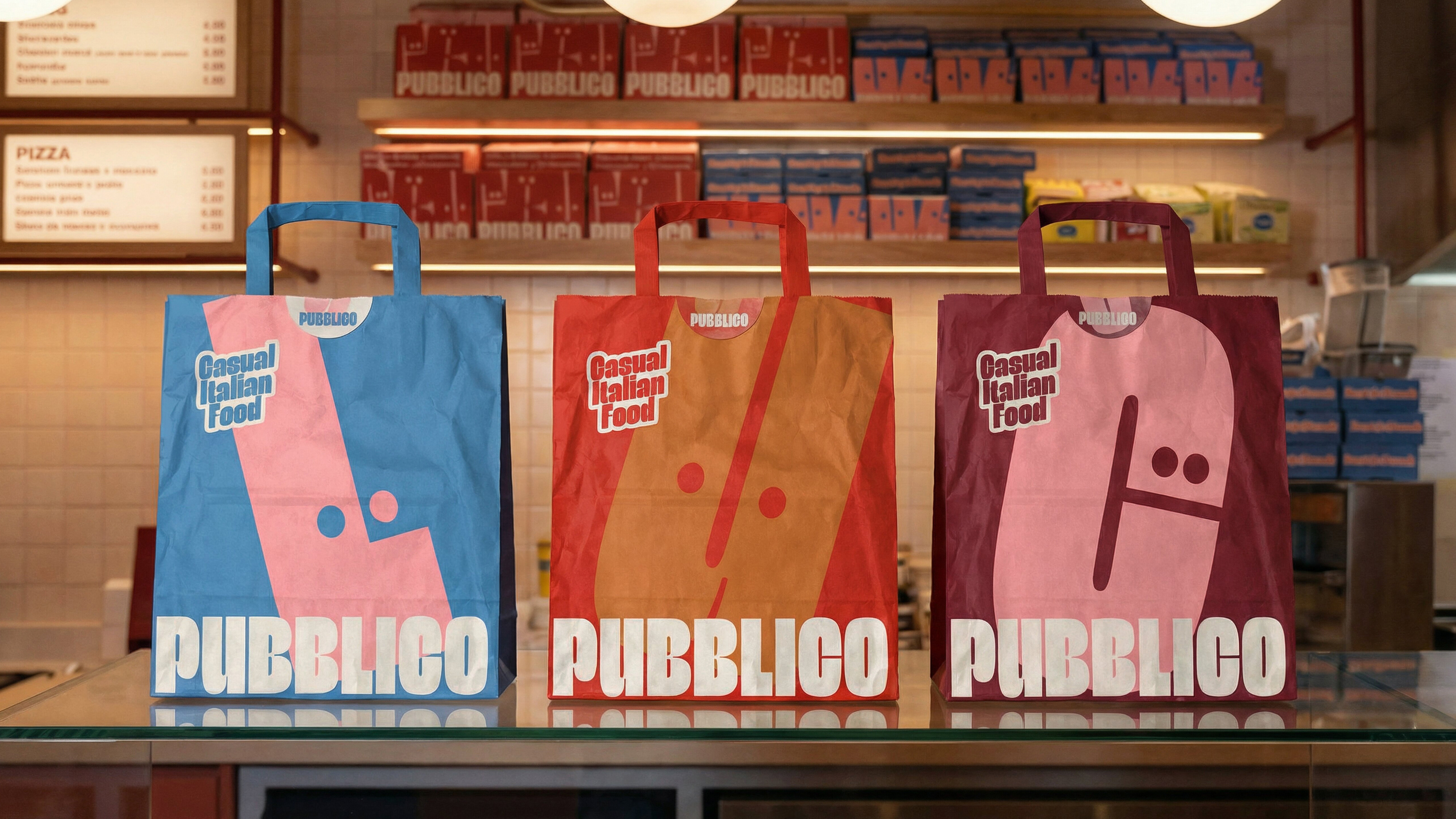
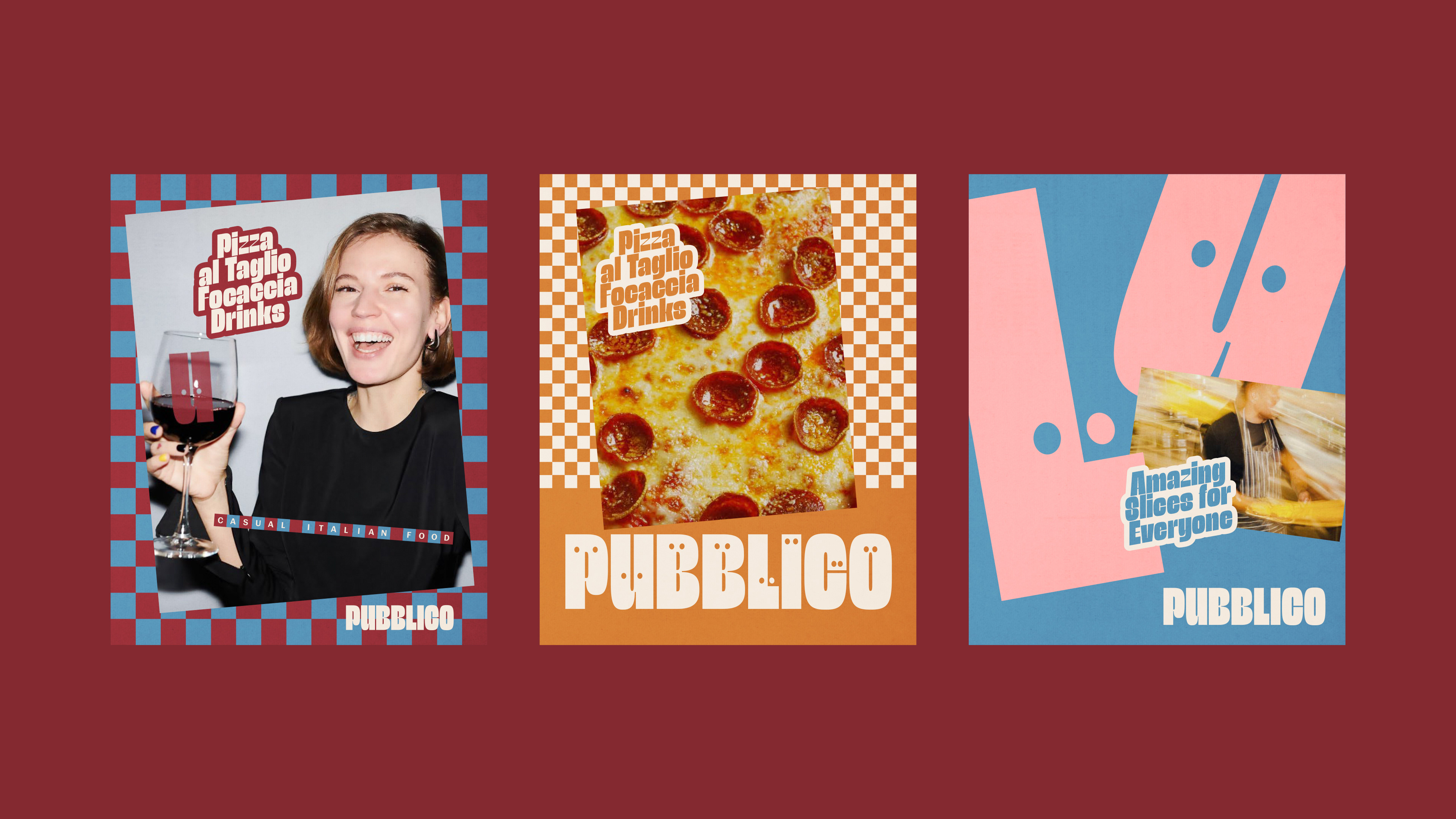
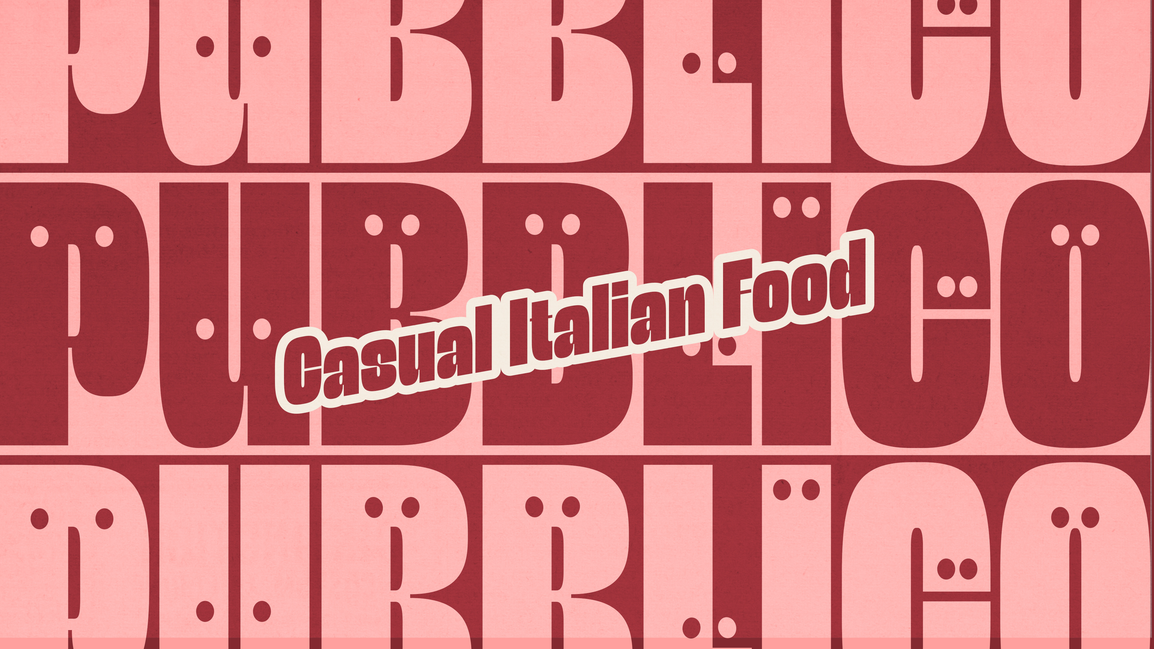
The logo was inspired directly by the word pubblico itself (Italian for public). The idea of people gathering together is subtly represented by the “eyes” hidden within the letters, turning the name into a lively symbol of community. The rounded, modern typeface feels generous and bold—just like the food: pizzas al taglio and focaccias, hearty and irresistible.
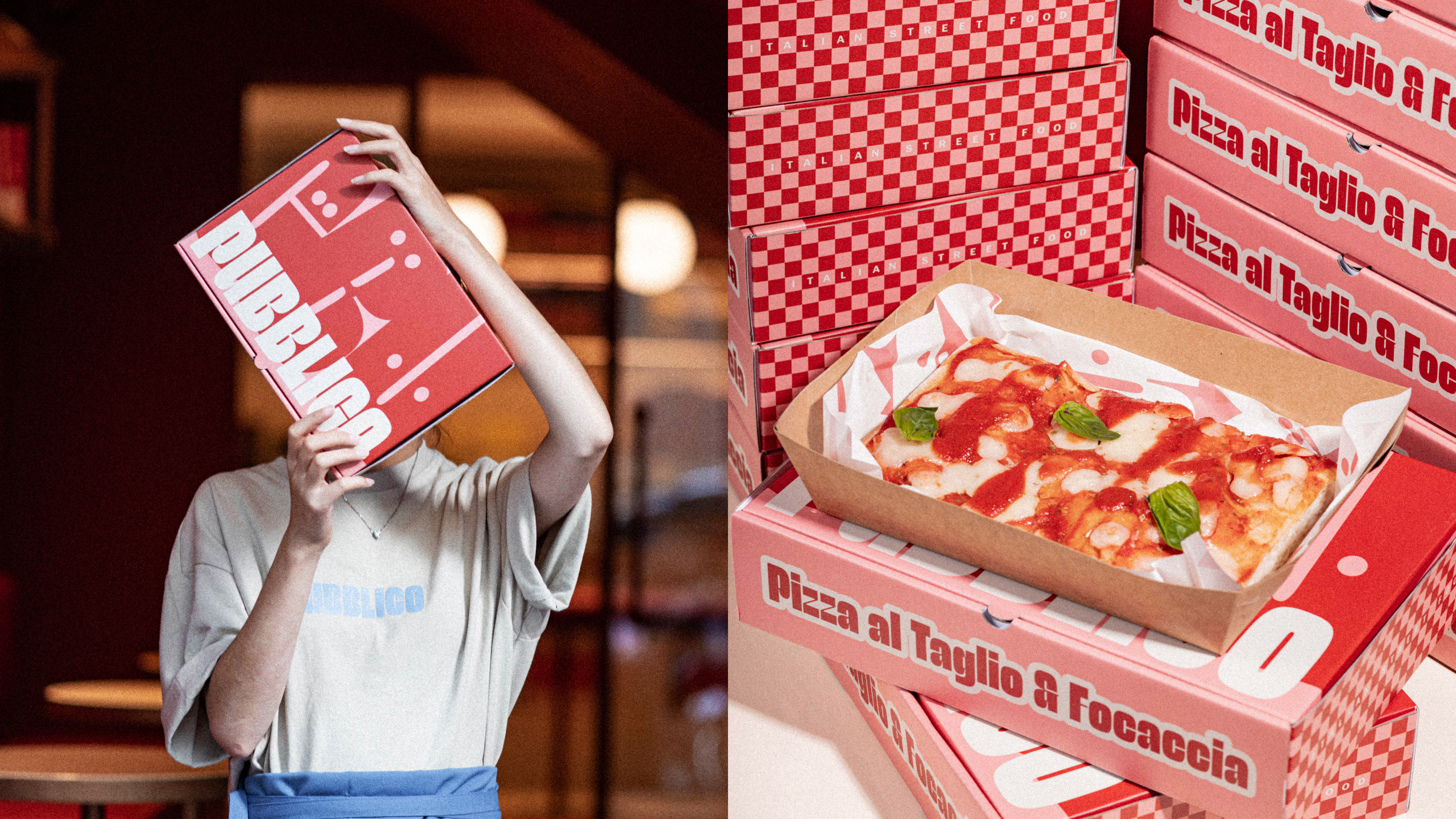
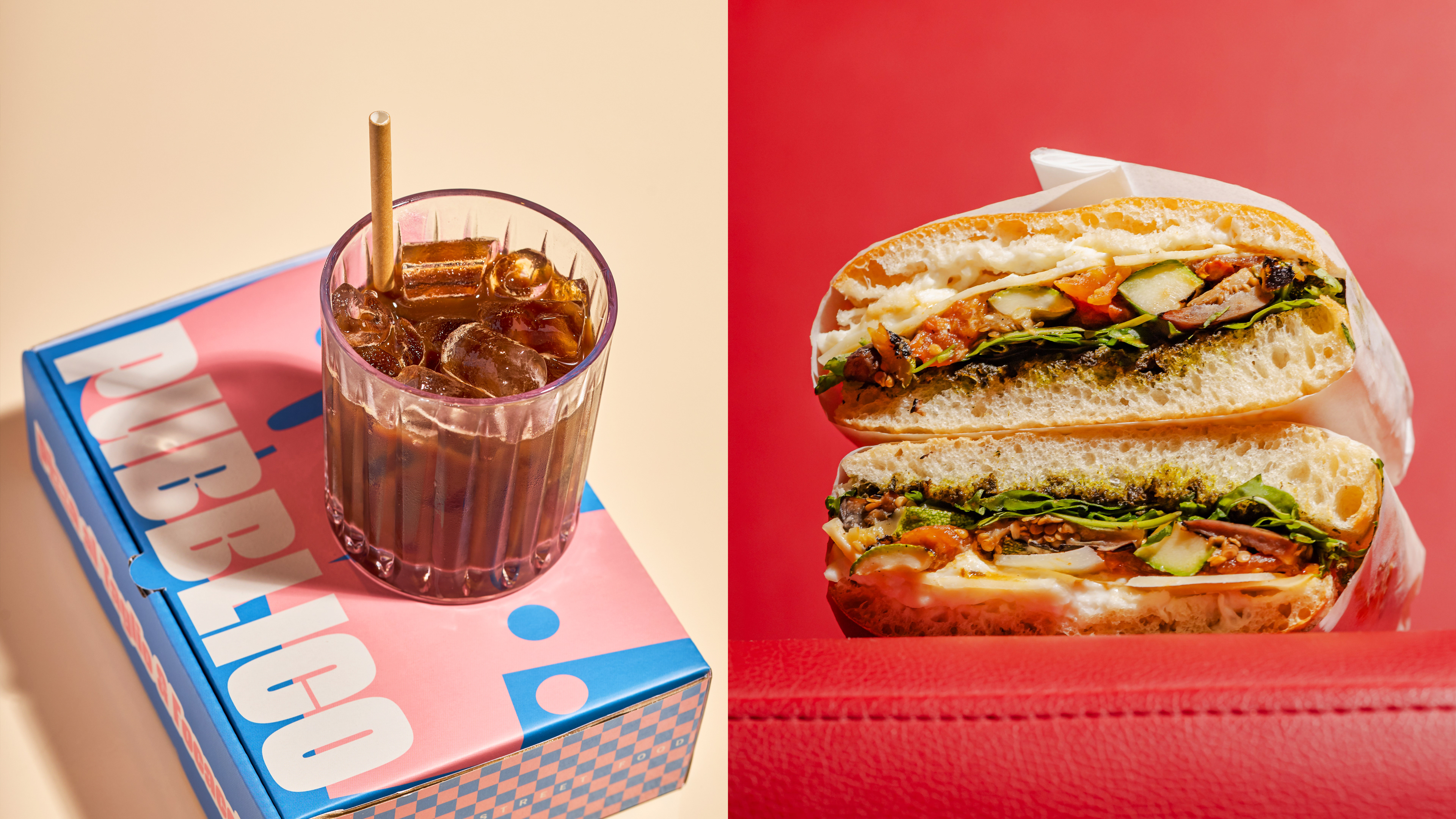
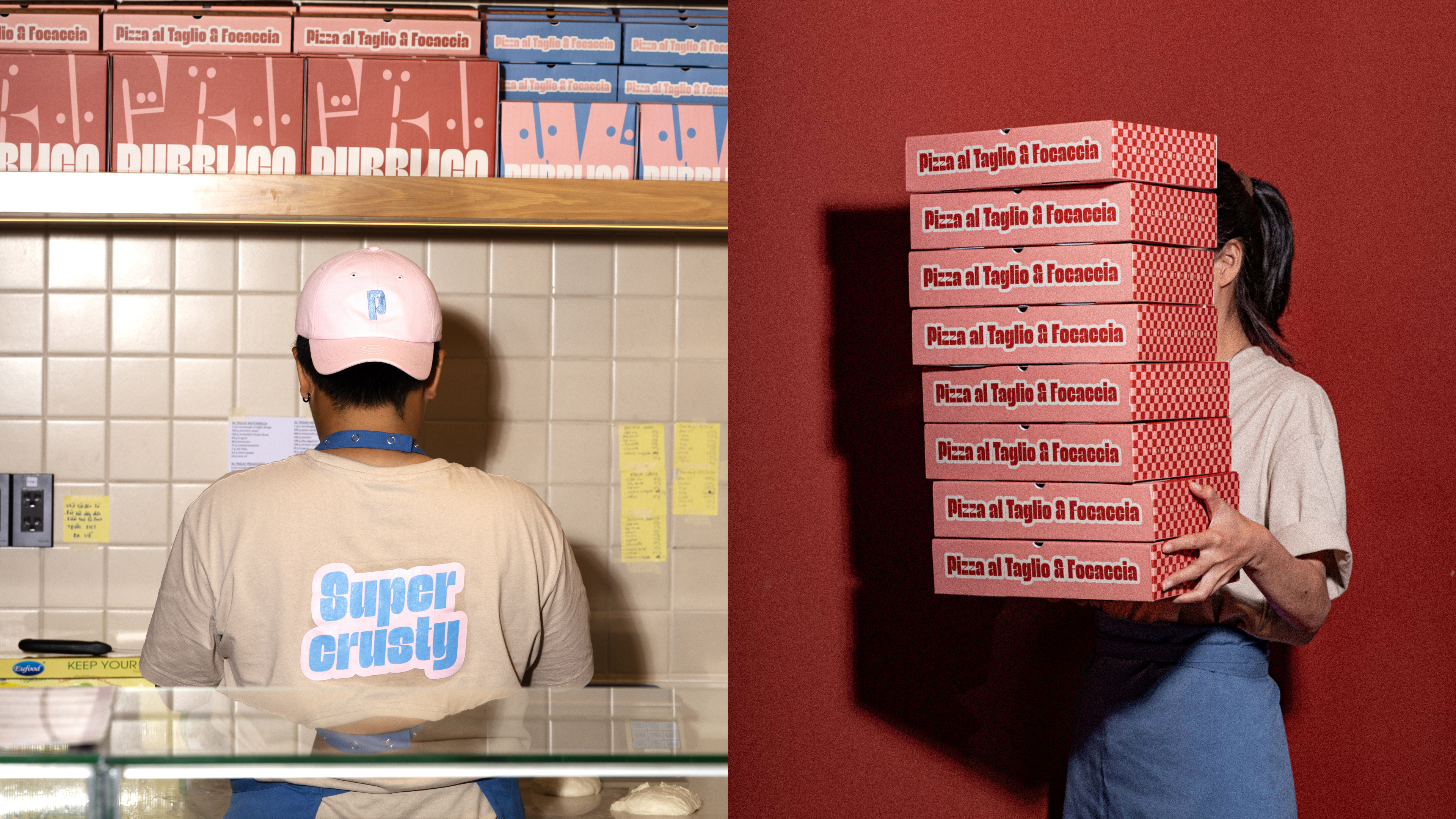
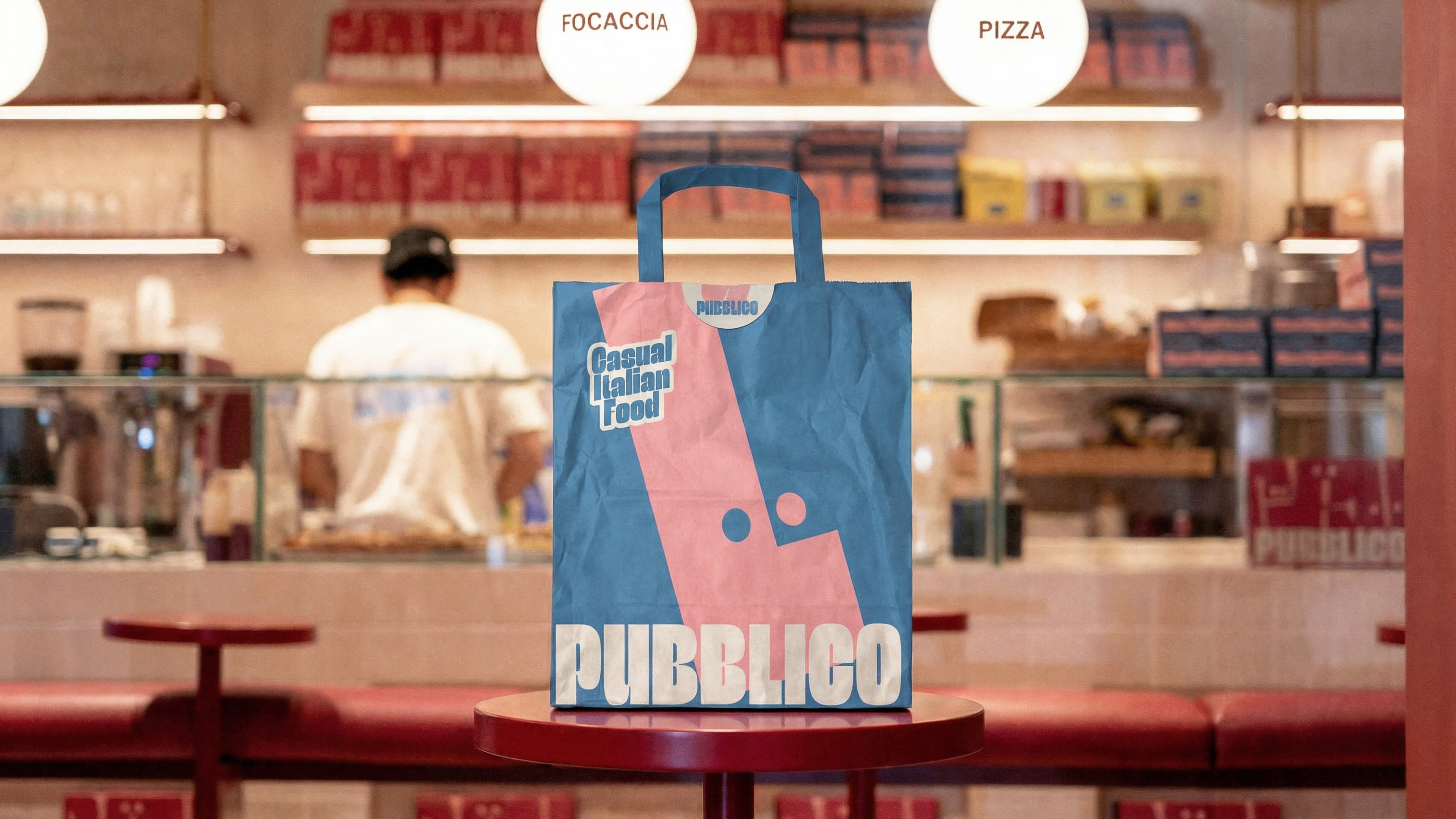
For the visual identity, we explored a vibrant palette of complementary colors—pink, blue, burgundy, cream, and orange. These tones, paired with graphic elements like checkered stripes reminiscent of traditional Italian trattorias, created a system that feels both familiar and fresh. Playful phrases were designed as stickers, easily applied to boxes, bags, and menus, reinforcing a young, energetic spirit.
Photography was just as important to the brand. Instead of stiff, staged images, we leaned into natural movement—the casual joy of taking a bite of pizza, the spontaneous laughter of sharing food. The result is a brand identity that feels as warm, fun, and flavorful as the meals themselves.